Strategic Reasons for Pringles Logo Change
We may not know the reasons for the logo change of the Pringles brand from the outside. But we can foresee the behind-the-scenes decisions made with informed interpretations. Logo design features allow us to have an idea about the changes.
Several times I have seen some advertisers interpret the simplification of brands as fashionable. I find this point of view a bit shallow. It wouldn't be a lie if I said it reminds me of the Dunning-Kruger effect. While technology is developing rapidly, people and communication are also changing day by day. Therefore, it is significant to adapt to change. Otherwise, it's easy for you to fall behind.
The Impact of Brands on Humans
Visual changes made by brands for rational reasons can upset loyal consumers from time to time. A consumer who expresses his admiration for the brand with a tattoo on his chest may even feel out of date after the brand's changed logo!
Maybe brands cannot be expected to think about logo design features in such detail. However, it is necessary to foresee the possible effects of the changes that will take place. And of course, it is necessary to create communication constructs accordingly.
Consumers who cannot figure out the reasons behind such changes often do. They accuse the brand of bad taste on social media. Such accusations are a source of stress for brand managers about logo design practices. This of course also points to the lack of communication. I think that loyal consumers who have established such a close relationship with the brand deserve to be informed ethically, even at a minimum level.
Don't you think it's time for brands to act more responsibly towards their consumers, whose psychology they influence with advertisements?
Switching to Flat Logo Is It Fashionable?
We can say that flat design is a 2-dimensional and simple design approach that has become more popular with the use of technology brands such as Windows, Apple, and Google. The flat design movement, which started with responsive design needs, offers simple forms that can be expanded according to the screen resolution. On the other hand, it eliminates visual noise.
Thus, users have a more fluid and optimum experience with appropriate design techniques. There are many logical reasons why flat design, which has entered our lives with the increase in interfaces, has turned into an approach that has an impact on brand logos. In my opinion, the strategic reasons behind the Pringles logo change are:
Minimalization Trend in Logos
Of course, it matters. But only because it causes brands to question this issue. So that's not the main reason to create a new logo design.
The Effect of the Channels
Media challenges designers. It's hard to put a detailed logo in the tiny favicon area or the Instagram logo area. Logos that have become even smaller in the story section should have plain forms. Otherwise, perceptual difficulties occur in the visual cortex. It is possible to see plain-designed logos more easily in difficult media. But complex logos create problems.
Effect of Regulations
As far as I know, many countries have regulations regarding the advertising of HSSF products. (HSSF = High in Sugar, Salt, Fat)
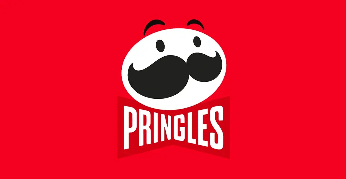
Emblem Mr. The "simplification" of P and the inclusion of text in a bow tie is an advantage for dark marketing. A bow tie is a good material to use in such situations. We have been using this type of perceptual method for years in our work for liquor brands. These are necessary for regulatory advertising.
This new version of Pringles' bow tie is a good perceptual solution to circumvent regulations when you don't include text. In the context of logo design examples, special attention should be paid to such details.
Need for Resuscitation
As part of the simplification, the glitter in the eyes is gone. The eyebrows are gone from the body. Thus, the ground was formed for animated emojis. It is easier to characterize a plain form this way. Details like these are important in the context of logo design features.
Graphic Design Requirements
Since one of the main needs of the new logo is to simplify the text by embedding it in the bow tie, balance couldn't include the lowercase letters in the bow tie. The yellow Pringles lettering is a minus point for the spirit of the brand. However, strategically, the brand side is probably aware of this. So there is shopping here. Some decisions bring about renunciations.
If the use of lowercase letters and yellow color had not been changed, the perception of the brand could have been protected better. However, when there was yellow in red, this time it would be this. The harmony between the white part in the upper part of the logo and the lower part would be lost. In this case, it would just add color (yellow) to the logo for the text. However, this is not in line with the idea of simplification anyway. For this reason, I think they gave up on yellow and turned to a full flat logo as it would suppress the red color on the bow tie.
Feature the Product
With the decrease in the number of colors in the logo, the product on the packaging stands out with its yellow color.
Here is the story of Pringles' new logo! :)
If you ask me if you like it, it didn't excite me. But at this point, commercial reasons outweigh pleasures. If we look from this window, there is a right solution in the middle.
Let's see if we feel like the taste has changed when the packaging is changed. :)