INSPIRE THE HUMAN
The human experience is the focus of everything we do.
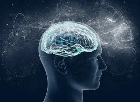
People make 98% of their decisions based on emotion; tapping into those emotions is at the heart of our creative approach.The human experience is the focus of everything we do.
People make 98% of their decisions based on emotion; tapping into those emotions is at the heart of our creative approach.