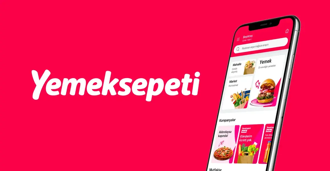
The New Design of Yemeksepeti; A Feast of Perceptual Friction
After the interface update, Yemeksepeti has been subjected to serious criticism, up to the level of lynching, on social media and Ekşisözlük.
We wanted to evaluate this change in terms of human perception, interface design, and user experience.
Is the interface bad or are users just not used to it?
User-Centered Design is defined in Wikipedia as:
This design method envisages designing the user interface by considering the user's purposes, habits, and usage experience, and even goes one step further, aiming to design the product in question with these user characteristics in mind even before production.
We can say that the users are accustomed to Yemeksepeti, one of the first e-commerce sites in Turkey. Therefore, although there were difficulties, it was not noticeable. Moreover, the site was successfully fulfilling its basic function.
There is a logic in engineering: If it works, don't touch it!
After many years, Yemeksepeti touched the design once and for all!
When the changes, which do not fit the definition of user-oriented design, combined with other design and software problems, the bomb exploded! Users started to hit the site ball. At this point, the opponents must have started to rub their hands.
On 14.06.2022, when we started to write this article, there were pages of complaint comments in EkşiSözlük.

Why Did Yemeksepeti Change Its Interface?
Yemeksepeti was recently acquired by Berlin-based Delivery Hero for $589 million.
Delivery Hero has a goal of stabilizing the user experience on all platforms within its scope. Accordingly, the interface of Yemeksepeti has also changed. Thus, Yemeksepeti was also exposed to changes in Delivery Hero's other food ordering applications. InstaShop, Foodpanda, and Pedidosya are some of these platforms. For the institution, it is not difficult to predict the administrative reasons for this change.
Frictionless Design
Above, we gave an example from engineering by saying don't touch it if it works. Let's continue in the same way. There is a risk of wearing parts due to friction that occurs during power transmission in machines. For this reason, for example, engine oil is used in vehicles.
The equivalent of this on the website is a good user experience. On a well-planned and designed website, the user must find his way. Ideally, there is no friction at all. When using an interface that is not designed correctly, we search, look, think, spend effort, and get tired.
We call the thinking and strain effect created by this friction "cognitive load". As the load increases, the experience becomes unpleasant. Therefore, low cognitive load is critically important, especially for e-commerce site design.
No one wants to get tired while using a website or app.
As humans, we are lazy beings. We are lazy because work takes effort. Meeting the effort creates more nutritional needs. It's safer not to burn too much energy for evolutionary reasons. Especially when the brain works intensively, it consumes a lot of energy. This is a good answer to the sentence "Did you carry a stone on your back, you work at the computer" :)
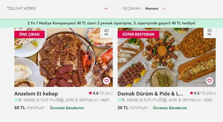
New Design of Yemeksepeti
Let's take an example of friction. When you want to open the window, you hold the handle, turn it 90° and pull it to open the window. Nobody uses a window handle that needs to be turned 540°. The person is the same in digital and real life.
Accessing the Filter on the Desktop Creates Friction
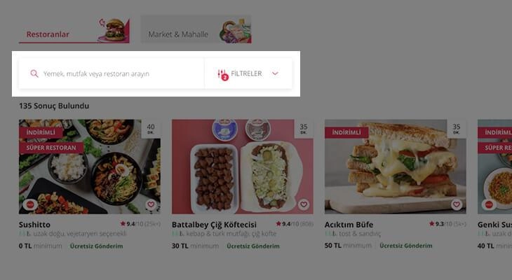
Let's say you scroll down 4 pages on the website. You want to make a filtering on the screen at that moment. And you realize that it is not in the design. Was there a filter button above, don't you remember? (Cognitive load.) I wonder if it's on the screen you're on but you couldn't see it? (Cognitive load.) That's why your eyes are searching left and right for the filter button. (Friction.) In the final, you have to scroll to the top of the site and click from there. The new interface of Yemeksepeti presents such difficulties.
Do We Want To Choose The First Address Or The Restaurant?
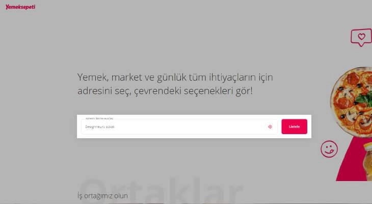
We have to choose an address every time we enter the site. Why would someone who always orders from the same place have to press the list button all the time? When people enter the site, they want to write the name of the food, not the address, in that box and quickly find what they are looking for.
Price Filter Ranges Should Improve
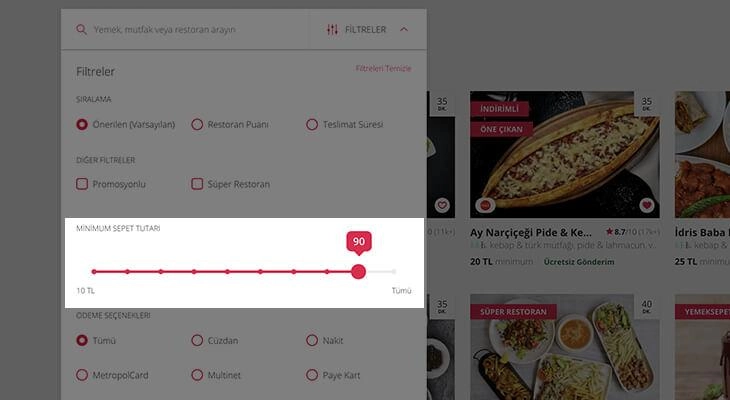
The price filter on the site proceeds with figures such as 10 TL, 20 TL, and 30 TL. Even if there is a possibility of finding a meal for 10 TL, you may come across restaurants that require 500-700 TL to order after 100 TL, as the filter intervals are disproportionate.
No Possibility to Empty the Basket Completely
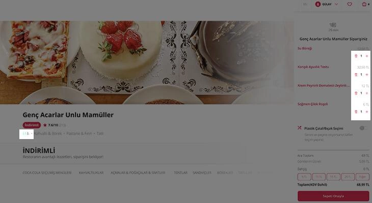
The site does not allow emptying the entire basket. It requires deletion one by one. There are two TL emblems on the interface that seem a bit confusing and unnecessary to us. The color is not visible. Moreover, its function is not clear to people.
No Payment Options in Restaurant Communication Areas
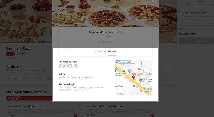
On the page where you get information about the restaurant, you cannot see between which hours the restaurant operates and which payment methods are valid. If there is no payment method you want on the payment screen, you are wasting your time.
We Can't See Which Restaurant We Are in the Restaurant Details
You were in and out of a few restaurants, but your phone rang. You're back, you can't remember which restaurant you're looking at while looking at the screen. Because the restaurant's name is not written on the restaurant detail page.
Legibility Problems in Fonts
The font weight of the font used on the site, in technical terms, is very low. Therefore, there is a serious problem with the legibility of the fonts. The fact that there is a font that does not tire the eyes and does not attract attention is a justifiable reason. However, it is a fact that there are more suitable fonts in small fonts that will fulfill this request much better.
We interpreted the changes by combining them with our neuromarketing, user experience design, and interface experiences and avoiding subjective comments as much as possible. There are many other details that require examination. But we're sure the interface will get better over time.
If you liked the article, do not forget to share it. :)