Frictionless Design and Experience for the E-Commerce User
It would be incredibly valuable if we knew the possible expectations of users when they enter the e-commerce site.

Since we do not understand this at least at the moment, we can consider creating roadmaps based on users' estimated behavior and expectations.
What kind of expectations does the user have when he comes to the page? Has this user already determined the product they will buy? Or is it a user who just wants to look at new products and spend time?
There is some quite valuable information here. Today, many brands still predict that users are in the psychology of clicking on certain categories. However, on the contrary, many users enter e-commerce sites to spend time. Or he goes in to have an idea of what's going on.
In other words, this is not much different from the experience of a person visiting the mall. It is a huge loss not to expect such users to visit the categories one by one by going to the links and to experience the shopping only in this way. As a result, it is very valuable to include the expectations and feelings of the users, which they are not even aware of, into the design processes.
Physical Store and E-Commerce Experience

If we walk around a physical store and come across a visual stimulus that we are interested in, we head towards that category. If necessary, we ask the officer questions. We fill our knowledge gap. Let's apply this knowledge to e-commerce. The pages should also inform the users with minimum effort (friction), make them curious, and have a structure that will make them click on the sections they want. For instance; it would be functional to show the newly released collections and styles on the site with the ease of a scroll. Of course, if it is planned correctly and designed in accordance with the brand DNA and neuro design principles.
As users, we need to use websites more passively, even if we are not aware of it. If possible, we will be happier if we have an experience where we do not touch any buttons or even make mental effort. For this reason, brands that improve the user experience on their site and reduce the barriers in front of users by simplifying the processes will step forward day by day.
As humans, we are lazy beings. We are lazy because working means getting tired. Getting tired takes energy. Especially when the brain works intensively, it consumes more energy. This is why mind-blowing work is tiring. Energy is an expensive resource. It is safe to conserve our energy because of our primitive impulses from the past. For this reason, it is easier for all of us to become a member of Yemeksepeti or Getir, order from our registered card with one click, or leave a site that makes us tired, instead of becoming a member of dozens of sites by getting tired.
A frictionless experience is not possible in theory. Because even if we remove the interfaces and experience only with the power of thought, this time the friction in the mind will continue.
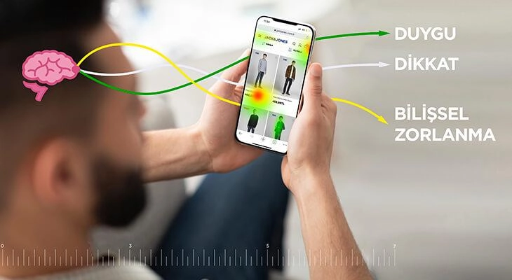
We call the effect of this friction "cognitive load". As the burden of a brand or experience on the user increases, the experience becomes unpleasant. That's why the low cognitive load is critical, especially for e-commerce.
The Need for Frictionless Design in Interfaces

With increasing frequency in recent years, brands are switching to a minimal, flat design approach. This is sometimes interpreted as fashion by some people in the industry. But in reality, it is not. The interface is a tool for us to use web and mobile systems, not the purpose itself. For this reason, the most important thing is to transfer the contents to the user with the most optimum friction.
When the interface leaves itself behind, the visual competition of the interface with the contents ends. Visual pollution is reduced. Thus, the contents stand out ,and the user can focus more easily on what he needs to focus on. This way he doesn't get confused. A clear perception is formed. Clean perception means low cognitive load. Of course, the flat, simple design approach alone is not a factor in this. But at least it's a step in the right direction.
On the other hand, there is a concept called "emotional bond" in neuromarketing research. This concept defines the link between the viewer and the content. The greater the emotional attachment, the greater the probability of purchase. I have previously discussed the importance of feelings in user experience from the e-commerce window. For more information on this subject, you can refer to my article on User Experience and Feelings on E-Commerce Sites.
Interface Design, Eye Tracking and Heatmap

When users browse the site, they do not see the instructions we put in the interface exactly as we imagined. There are many factors that affect focus. As a matter of fact, while users see the focal points clearly, every surrounding area becomes blurred. This is called Peripheral Focus - Peripheral Focus. Users' eyes scan objects on the screen. With the effect of placements, colors, figures, frames, density and more, it becomes clear where the eye will or will not see.
80% of users can ignore the buy button that you think everyone will see.
Then don't say my product sales are bad or my conversion rate is low. For this, it is necessary to have deep knowledge of neuromarketing / eye tracking in e-commerce processes. It is very valuable to interpret the situations correctly and to include the possible behaviors of the user in the design processes.
Even if you can take into account the mental processes of the user, the subject evolves to a completely different point. You can also read the article Neuromarketing and Perception to learn more about unconscious processes.
On the other hand, there are systems that interpret the user's mouse movements on the screen and generate heatmaps with it. These systems have nothing to do with eye tracking. If the user takes the mouse to a place on the screen, he is already taking it because he sees it. We are interested in what the user cannot see or what he feels when he sees it. These types of systems do not promise eye tracking efficiency as they do not provide real eye data. Yet data is data.
In this article, I tried to stay at the fine point between academic and real-life scenarios. If you liked the article, don't forget to share it. :)