A Design Chat With Apple Art Director Mel Zahar
A design chat with our former colleague, now Apple Art Director Mel Zahar.
Mel Zahar is an Egyptian Art Director and Designer. He brings a holistic perspective to the works he manages and designs with his creative skills and technical knowledge. He designed multimedia product and visual experiences for brands such as Nike, Apple, Tesla, Beats By Dr. Dre since 2009. We talked to him about digital creative agency and perception of design, human factors, culture, and trends in Turkey from a foreign perspective.
What was it like working and designing in Turkey? Do you want to compare it with the USA? And why did you choose the USA?
Melz: I can say that I spent my best days in Istanbul. I was quite young, I had dreams of learning and progressing. Turkey is a huge market. There is a super rich culture in every respect. The amount of creative work in the country is also truly incredible. The USA, on the other hand, is the land of opportunity. Progress comes with pressure and hard work. When you are not in the country of your birth, the pressure on you automatically increases. Especially in such huge markets, much more work is needed. It is necessary to adapt very quickly and seize opportunities.
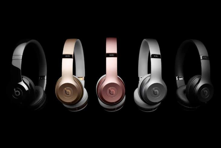
Melz: Living in the US wasn't exactly my goal. My goal was to work closely with organizations like Nike, Apple and have more control over the content. That wouldn't be possible living on the other side of the world.
What are you focused on right now? What's next, can you expand a little more?
I am currently working on a product category as Art Director at Apple. I'm on the side of visualizing hardware, preparing both static and animated images for the Apple marketing department. I am also interested in product creation. I build a brand and design experiences for it. Finally, I am interested in the metaverse and VR experiences.
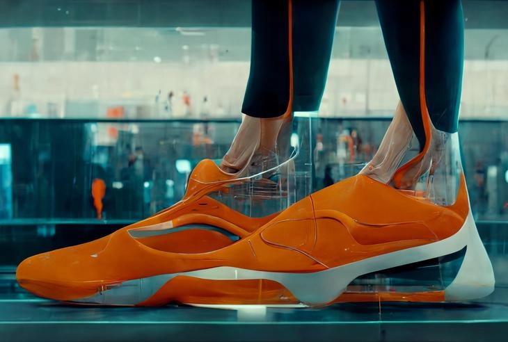
Artificial Intelligence and Design
You have been sharing the works produced with artificial intelligence frequently lately. So what kind of tool do you think artificial intelligence is for design?
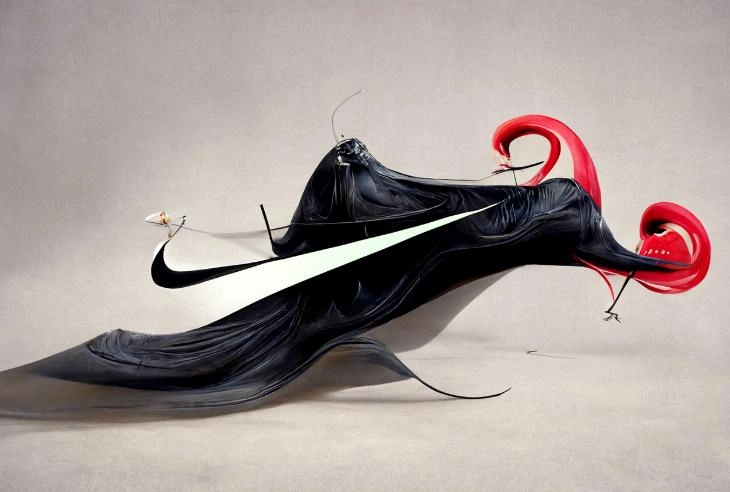
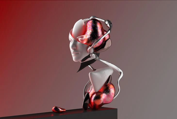
Melz: I think the age of artificial intelligence has begun. All designers and artists should embrace technology. They should use it in a way that is beneficial to them. I find it fascinating and versatile. It is possible to create design ideas through artificial intelligence by just typing a few words. In this way, we make more accurate decisions. We quickly see what will work and what will not. We don't have to spend hours browsing the internet for digital creativity ideas and reference ideas.
I am currently using Midjourney as a tool. Frankly, I'm waiting for an invitation for Dall-E too. My main use here is to create ideas that will come out later. Then there is the transition to CGI and photo tools.
Fuat: I'm trying Midjourney these days too. I'm still looking more experimentally. However, the possibilities offered by artificial intelligence are great in terms of producing graphic design project ideas and visual ideas.
Can you share your thinking and designing process as a designer?
I review the client brief and objectives before considering any ideas. I need to be aware of the message and need. So I start researching, analyzing ,and finding great references. This is where ideas and digital creativity often come from. I visualize these ideas by making as many sketches as possible. Then I choose what might actually work and eliminate the rest.
Finally, the execution part, which in my opinion is the most fun part, begins. So taking good ideas and putting them out in the best possible quality.
Who are your favorite designers?
Melz: There are many studios and designers whose work I follow. For example, Ars Thanea, Ash Thorp, Nando Costa, Man vs Machine, Future Deluxe, Tim Zarki are some of them.
Colors in the Design Process
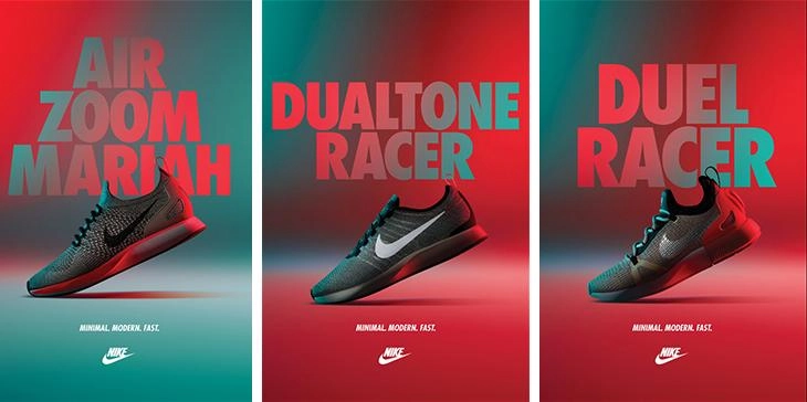
Colors are also part of the design process. You use them well. How do you choose the colors?
Melz: Colors are very similar to words, feelings, and thoughts. Because they are all interconnected. Colors convey what you cannot put into words, such as brand size, and the nature or philosophy of the product. I choose the colors considering the emotions I want to make the user feel. I also use colors to define my style in my works.
In today's world, people have little time. An unaffected product, image, or user experience has no chance of surviving. At this point, it is gaining importance day by day to design frictionless and to ensure that users are not challenged at the cognitive level. Have you had this type of experience with the brands you work with? If so, what would you like to share about this process?
Melz: As Elon Musk said, “The product that needs a guide is broken.” Understanding human psychology, emotions and behavior is undoubtedly the key to a good product. That's why I believe that continuous analysis and research make brands grow. Frankly, at this point, I would love to learn about neuromarketing research and what you offer to customers.
Fuat: Actually, we are not a research company. But of course, we believe in the power of research and data. We work with ThinkNeuro, Turkey's leading neuromarketing research company, when necessary. Thanks to the measurement methods used in the field of neuromarketing, we produce the most suitable solutions for customer needs. We use EEG and Eye Tracking as technology. Thus, we collect data such as where the user looks during an experience and how he feels at that time. Thanks to this data, a better end-user experience is possible. As certain principles begin to settle in time, they are also embedded in the design culture within the agency. Our awareness of personalized user experience is increasing.
What are your favorite ads lately?
Melz: I would like to say about the privacy campaign at Apple. I liked the cinematic storytelling approach. This approach is a very good and entertaining example of a good message being conveyed correctly and touching the mind of the user.

Simplicity in Design
There is a trend of simplification in design around the world. What do you think are the reasons behind this trend?
Melz: Simplicity is the key to more users, and it's also a way to beat the competition. Today, many global brands have grown like this despite tough competition in the market and the like. Users naturally choose the easy one. If possible, they want to do something without any effort. This is a business idea in itself. For example, you facilitate the use of a product on the market. In this way, the user experience designer develops a successful product. Since the product is already on the market and it is easier to use, users will quickly switch to the new product.
I would like to ask our young friends who will read this article. How did you work to get to this point? What kind of roadmap did you draw for yourself, would you like to share it?
Melz: I would strongly recommend that they set a specific goal. Of course, they have to make a lot of plans for themselves. Because plans change from situation to situation. When designing goals, they also need to focus on doing the best work. They have to pay great attention to small details. This is something I learned from my boss Fuat Kanık while developing online interface design in Istanbul. It is necessary to publish the works online, to follow the trends and to produce in those trends, to learn from the best, and never be stuck with what you are doing. Good designers always doubt their work. Critics make them happy, not hearing good things. And they take the comments into account.
Fuat: At this point, I would like to add. As if when we say boss, the distances open a lot. We are mostly colleagues who have worked together in the same company and have not lost their sincerity even after years have passed. I think it is very valuable to achieve this. From time to time, of course, I try to give advice and pass on information to my colleagues. I am honored that you have considered this advice and guided you. Thank you for sharing.
Human-Centered Design
Shoes, a website or a poster... Although these products are different from each other, basically all of them appeal to people. What do you care about in a human-oriented design approach?
Melz: As a user, it matters how much I connect. As a designer, I think what triggers my interest is the accuracy of the design. Design taste matters, but does it bring something new to the table? Doesn't it sound familiar? Colors grab my attention if they're in a unique way I didn't think possible before. I find many of these especially in the world of interior design.
How can those who are curious about their work see?
Melz: My work at www.melzahar.com or IG mel.zahar. They can track them at.
Fuat: Thank you, Mel.