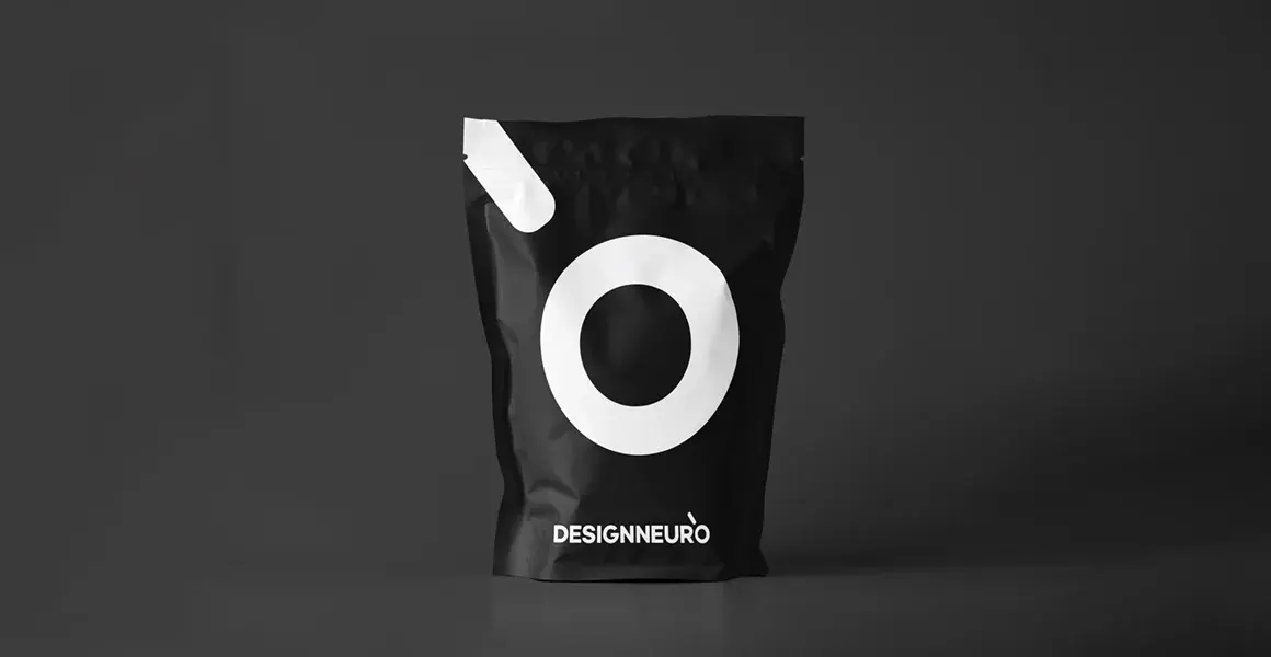
Packaging Design with Neuro Design
One of the most significant elements that differentiate the product is the packaging design. This design is very important in terms of the impression that the consumer will have at the first encounter with your product. So what does neuromarketing say about it?

In today's marketing world, differentiation is one of the most important goals. Packaging design is one of the main elements that provide differentiation. Packaging has a substantial place in differentiation in terms of the impression that the consumer will have when they first encounter your product. The vision of the brand is reflected in the product with the packaging. The features of the product reach the consumer. We also see the importance the brand attaches to its business and the value it gives to its customers. Today, we will talk about neuro design and packaging design for a more effective packaging design.
What is the Relationship Between Product Packaging and Purchasing Behavior?
Zdenek Kucera, CEO of CB Design Solutions, an international packaging design company based in France, says, “If the packaging has enabled a consumer to receive that product, 70 percent of the consumers will buy that product.” He also adds that this rate is higher in children.
However, in the marketing budgets, the lowest budget belongs to the packaging design. In this context, “How can I do this job the cheapest?” It's a very wrong question. Instead, brands ask "How can I present my product most accurately and beautifully?" they should ask. The rise stories of brands with this perspective are more valuable.

In short, packaging design is an element that directly affects the sales of the product. So how does neuromarketing data guide packaging design?
Every font, color, information, etc. used in packaging design. directly affects the consumer's purchasing choice. Anyone who reads this blog knows this.
First, let's talk about 'cognitive load'. It is not good for any visual stimulus to contain too much information. In this case, consumers experience perceptual difficulties instead of getting an impression and experiencing an emotional increase. It is a great risk that both the focus of attention will be dispersed and a strong message will not reach the consumer. The beginning of today's simple design approach is based on understanding which job works better. Today's consumers, who act with their emotions, are disturbed by the increase in cognitive load. If they do not buy a product that is extremely important to them, they may give up their buying behavior.
How Should Be Packaging Design?
Let's give an example through the images on the packaging. Let's say you have a chocolate biscuit package. The half-biscuit on the package draws the attention of the consumer not to the text, but to the chocolate flowing through the biscuit. At this point, it is significant what the brand wants to highlight. It may be a good choice to focus on biscuits if preferred. However, in cases where this effect is not made consciously, some objects prevent the product message from reaching the consumer.
Packaging design is critical to marketing. It is necessary to create awareness in the consumer with product packaging design examples and to continue the effect of the advertisement in the supermarket. Dozens of functions such as supporting the sale of the product, informing the consumer, and selling the product are realized thanks to the packaging. In this respect, the packaging is the face of the brand that speaks to the consumer. All the efforts, production, logistics, purchasing activities, and advertising activities are for the perception and examination of that product on the shelf by the consumer.

For this, as well as making a package look beautiful, the messages on it must be perceived by the consumer in the order of importance the brand wants. What should the consumer see first? Is it the product, our messages, or the figure using the product? What is the headline read rate? First of all, it is necessary to answer such questions. Then these answers should take their place in the packaging design processes.
Let me point out when it's time. More information on simplicity and cognitive load in design is available in our article on the importance of simplicity in terms of neurodesign principles.
Another interesting example is this. The geometric shapes used in packaging design have significant results. According to research, consumers view curved lines and rounded edges more positively than straight lines and sharp edges.

The last example is about colors. Colors have many effects on human emotions. When choosing a color, you can more or less guess how consumers feel when they look at that packaging. For instance , consumers view matte colored designs more positively than bright colored designs. Or, if you've launched a product for professionals, dark blue colors are a better choice for packaging. In this way, it is possible to attract the attention of professionals more easily.
Looking at Packaging Design with Neuromarketing
All this information is unlikely to be obtained by traditional methods. It is not possible to evaluate issues such as the fact that any consumer looks at slashes more positively, that the bitten biscuit can affect focus, and cognitive load with surveys. Because these are activities that consumers perform unconsciously. However, this does not mean that surveys are unnecessary. All kinds of data and information should come to the marketing desk. But it is necessary to provide the right combination of them.
At this point, there may be those who want to get to know neuromarketing more closely. You can click the link for everything about neuromarketing.
5 important items for packaging design with neuromarketing:
1. How does the product differentiate from competitors on the shelf?
2. What is the perception that we want the product to create in the consumer?
3. Has the cognitive load that the packaging will create on the consumer participate in the processes?
4. Is there an order of importance for the main message and images?
5. Were the unconscious reactions of the target audience included in the design process?
A packaging that answers these 5 items correctly will have a positive effect on product sales.
Neuromarketing, which comes into play in the examples above and similar points, shows the positive and negative points of the design with the tests carried out on the target audience. Afterwards, what the brand and designer should do is to revise the design according to these insights. This will certainly increase product sales.
As Designneuro, we add our experiences from our past works to our creative processes by blending them with scientific research.