
ReCream Creative Works
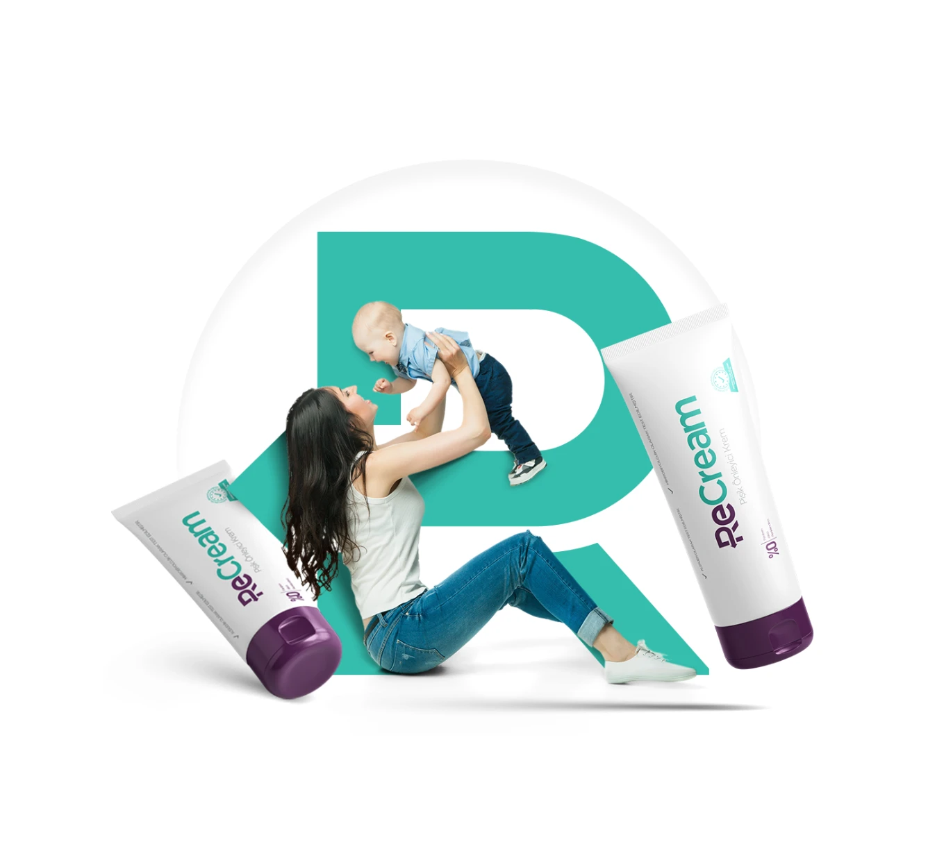
ReCream is a baby care cream that soothes the skin of babies and relieves the hearts of mothers.
ReCream
A phonetically correct, market-friendly, easily understandable, and meaningful brand name for the new diaper cream to be introduced to the market was needed. Then, a corporate identity that can represent the brand correctly on all platforms and design packaging for market entry was required.
SOLUTION
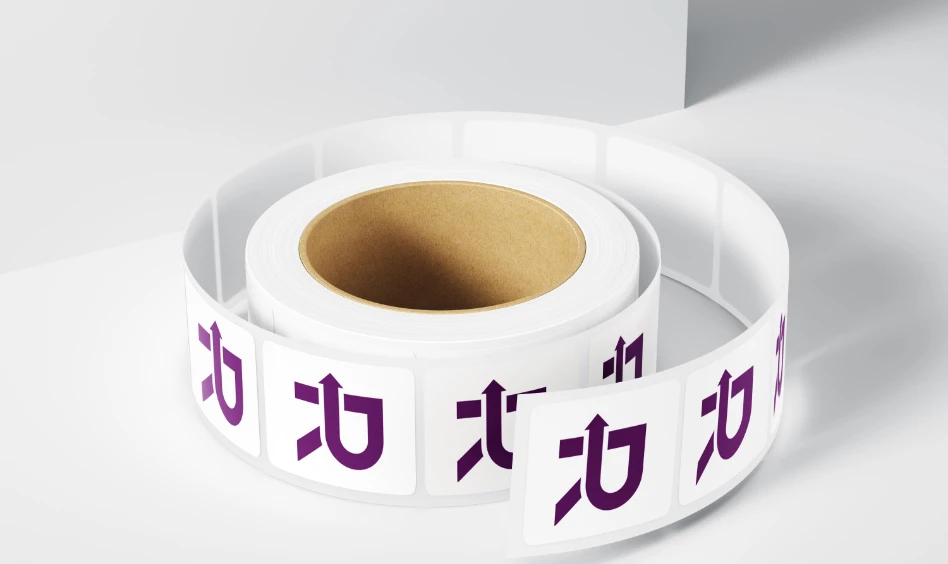
The idea of "recycle into better" that the cream promises inspired the brand name. Based on this effect, which we named "Re Effect," we presented the brand to the market as ReCream. We also added to the typography the recycling movement visually, so a logo that matches the brand story emerged.
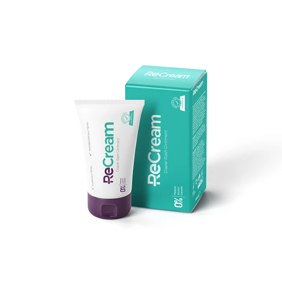
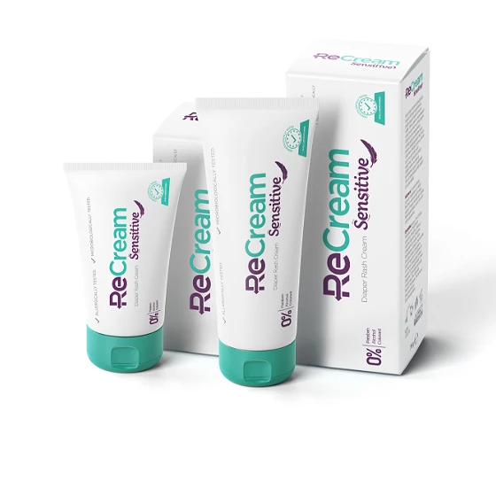
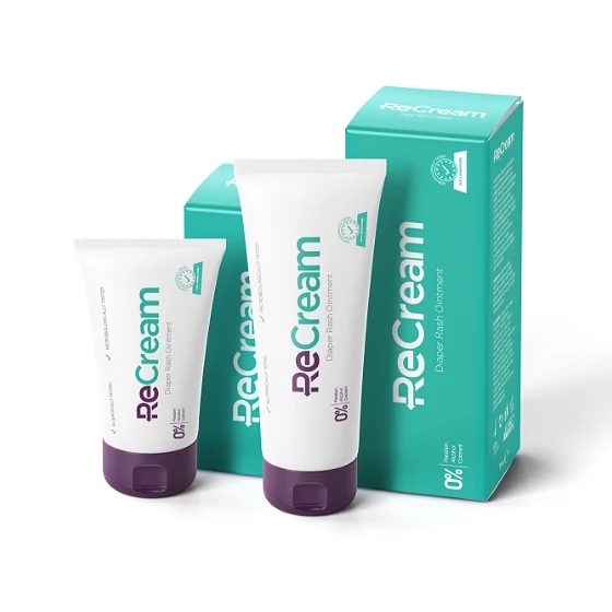
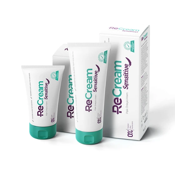
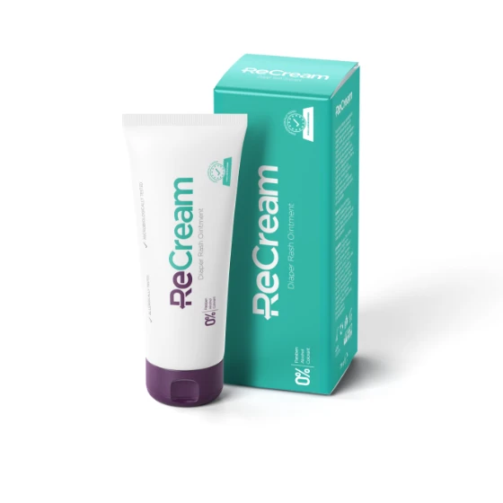
When determining the colors, we chose green to convey naturalness, and purple to differentiate from competitors on the shelves.
DESIGN ELEMENTS

PACKAGING
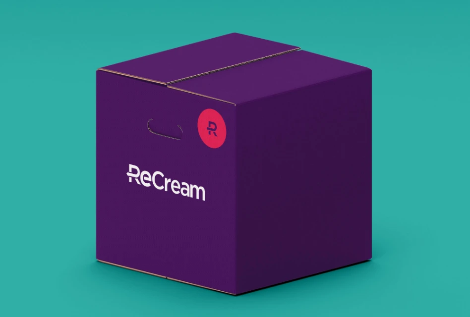
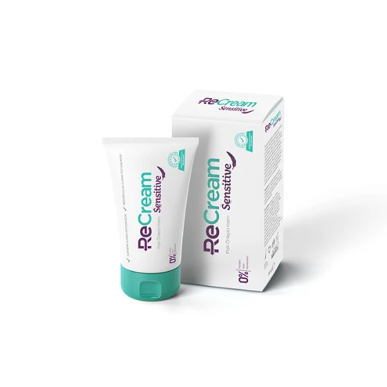
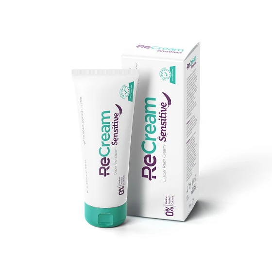
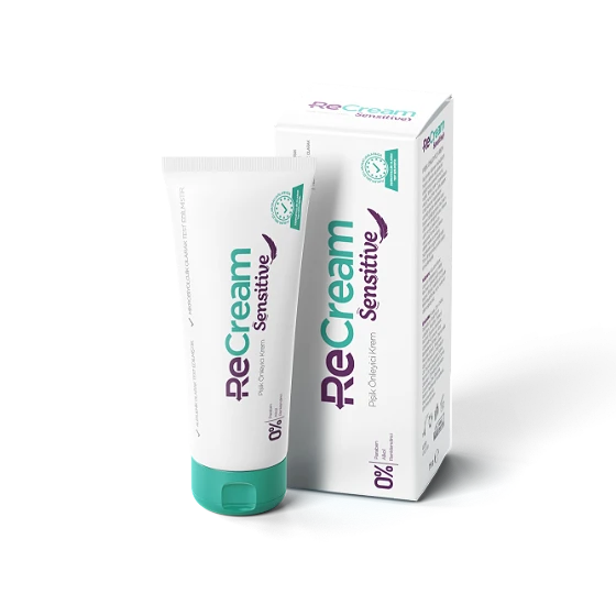
Knowing that a consumer who walks between shelves can perceive a too-segmented box as graphically smaller than it actually is. For the product to be well perceived and stand out on the shelf, we designed a one-piece, frameless, uninterrupted, and extremely simple packaging.
Outcome
The product, which was successfully launched in Turkey, reached the Russian market in a short time of 3 months. In the first year, the brand was acquired by the global pharmaceutical company Biocodex due to its successful results.


