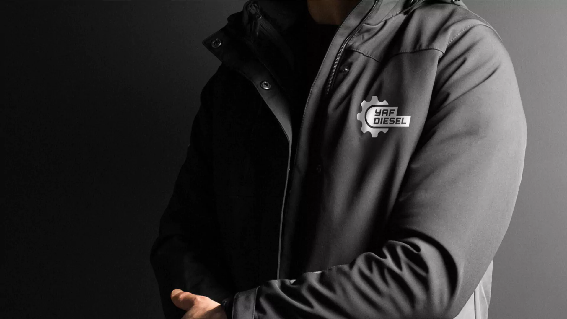
Yaf Diesel
Since 2008, Yaf Diesel has been a strategic player in the global maritime industry, with a presence in various regions around the world.
Logo Design
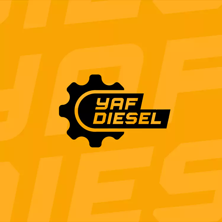
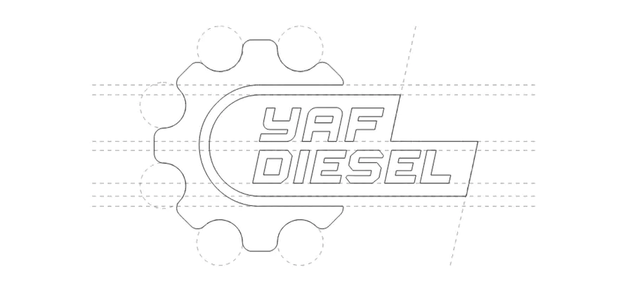
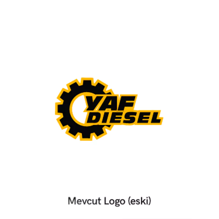
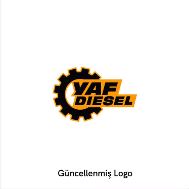
The brand's original logo was overly complex, filled with too many visual elements that created unnecessary clutter. We simplified the logo, choosing a modern typeface that emphasizes technology and engineering.
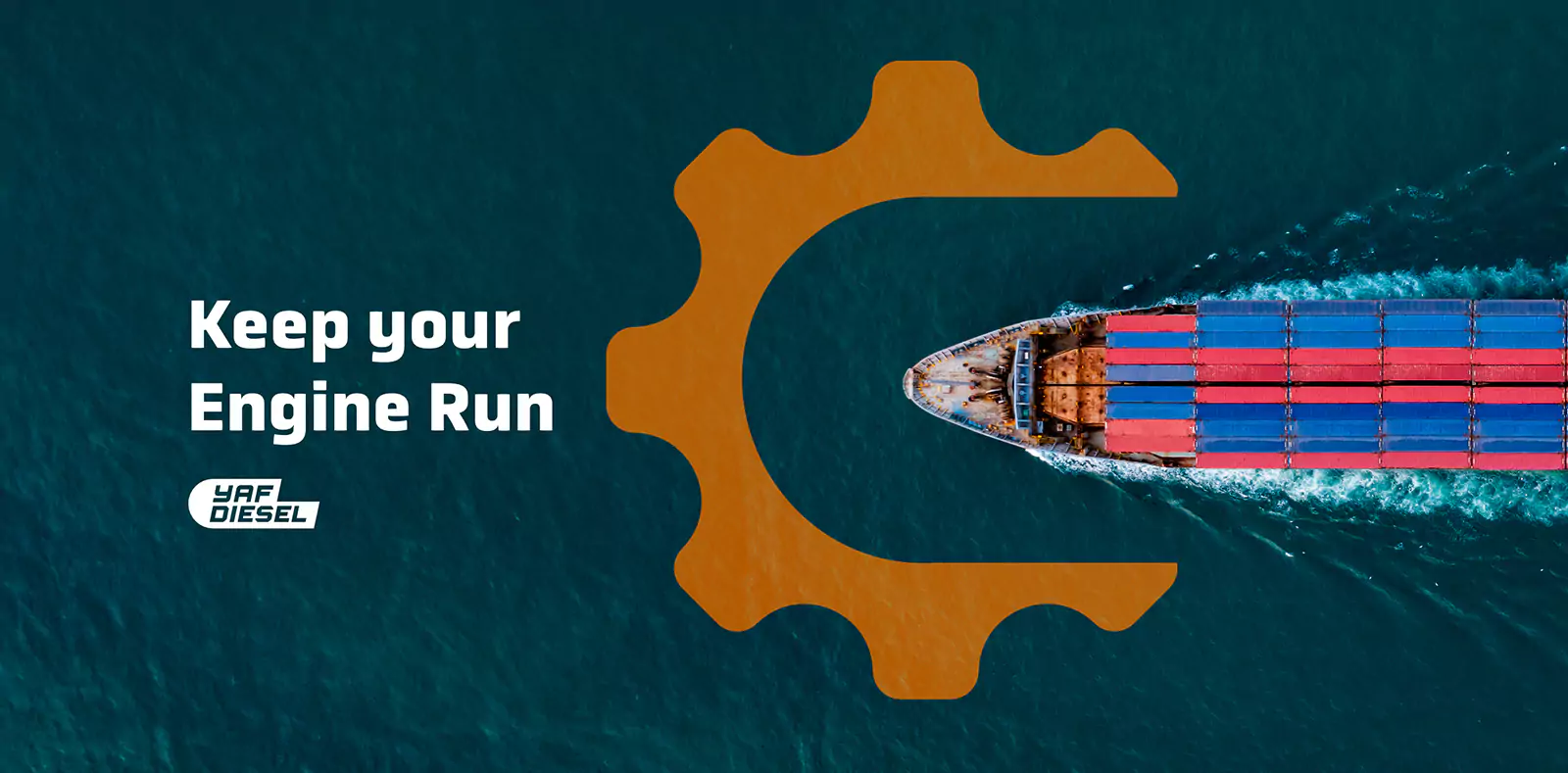
In redesigning the logo, we kept a connection to the brand's history while infusing it with a contemporary and meaningful style. The new logo embodies the concepts of a ship's wheel, a safe harbor, and a well-oiled gear, all represented through a cohesive visual language.
Our Approach During the Redesign
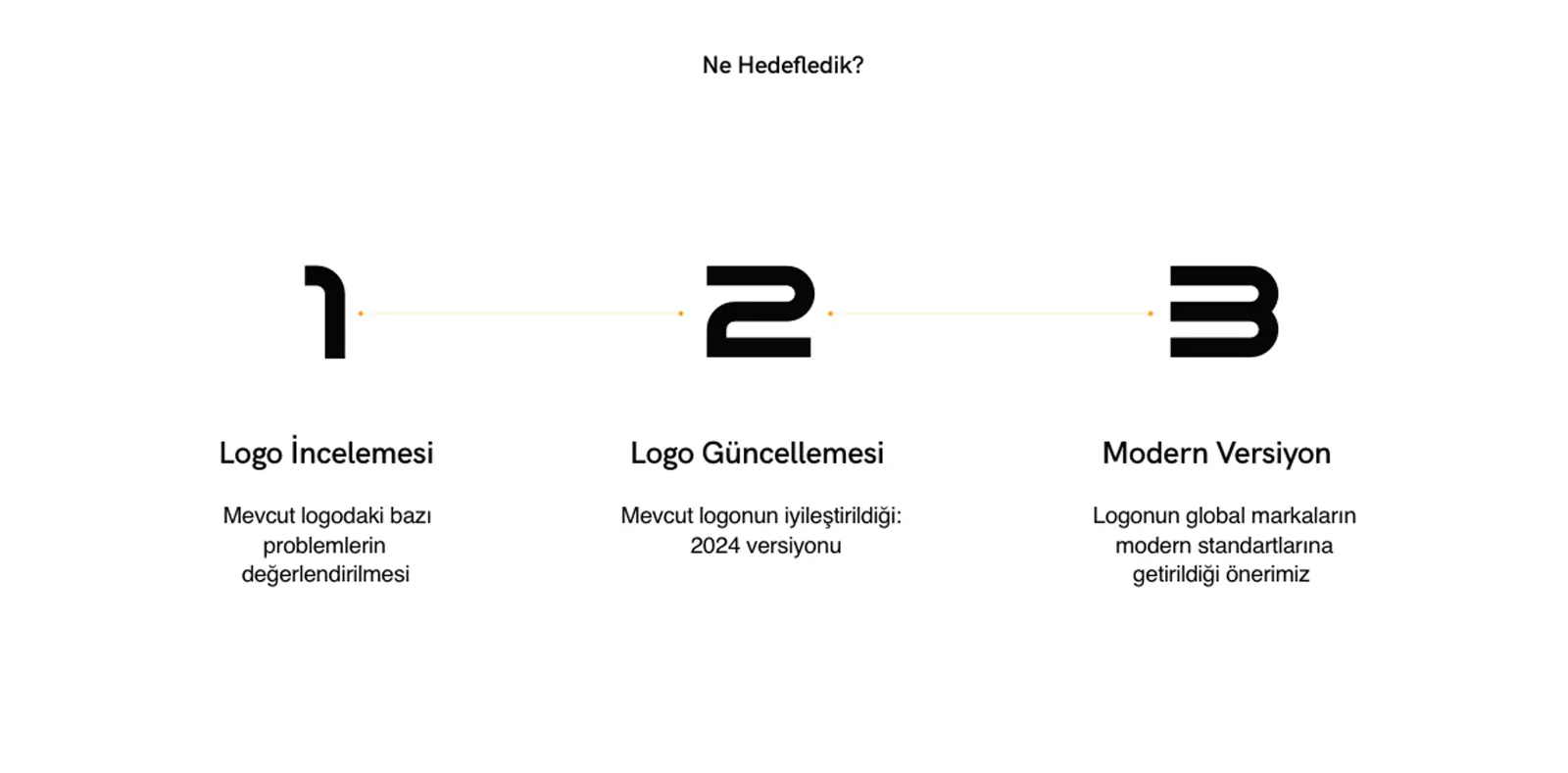
Initially, there was no plan to change the logo. However, recognizing that the logo is one of the most vital and functional visual assets for any brand, we decided to take a closer look. We identified the problematic aspects of the current logo, explained the need for change to the client, and developed a strategic plan to guide the transformation process.
Corporate Identity
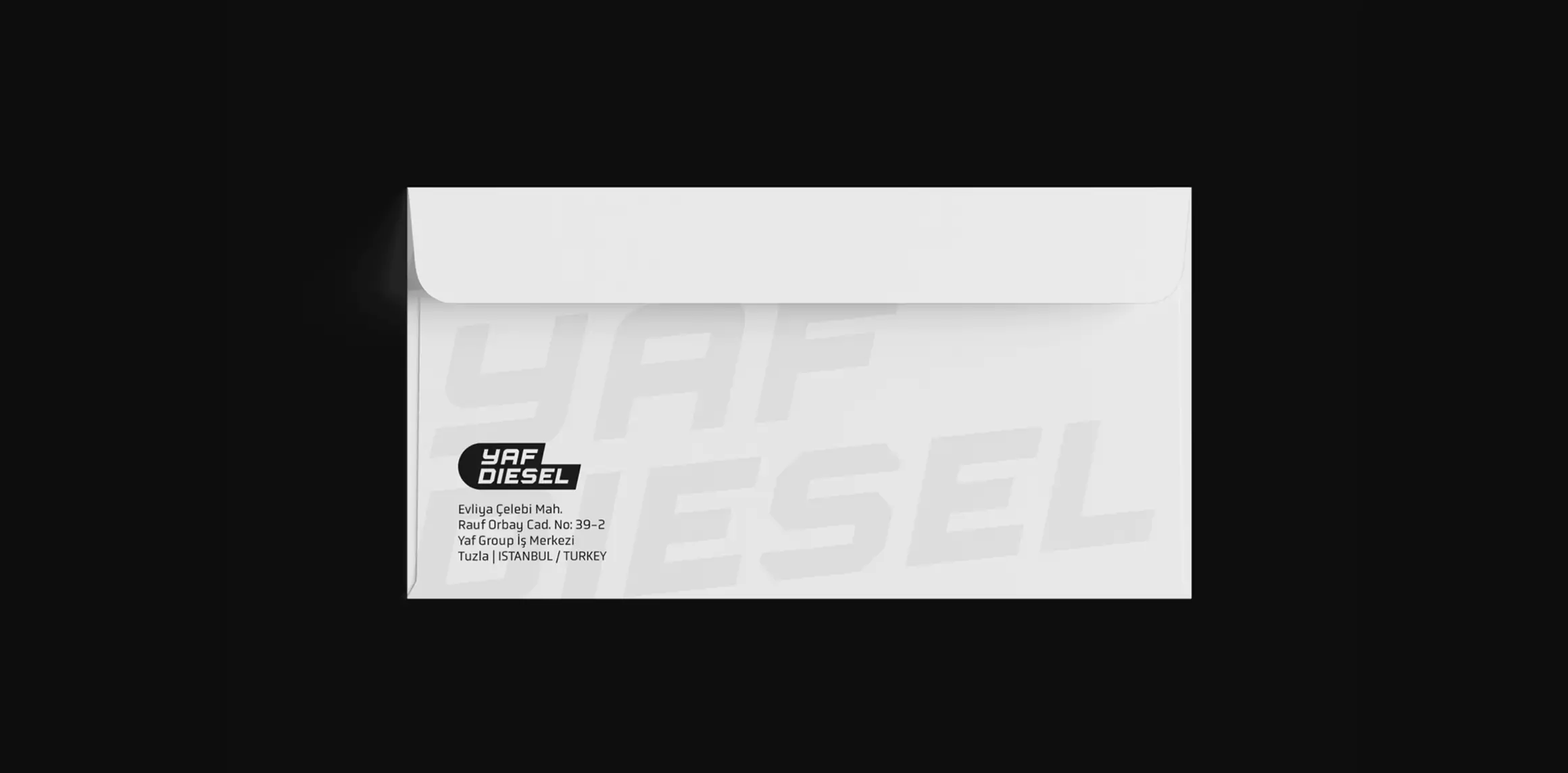
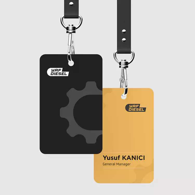
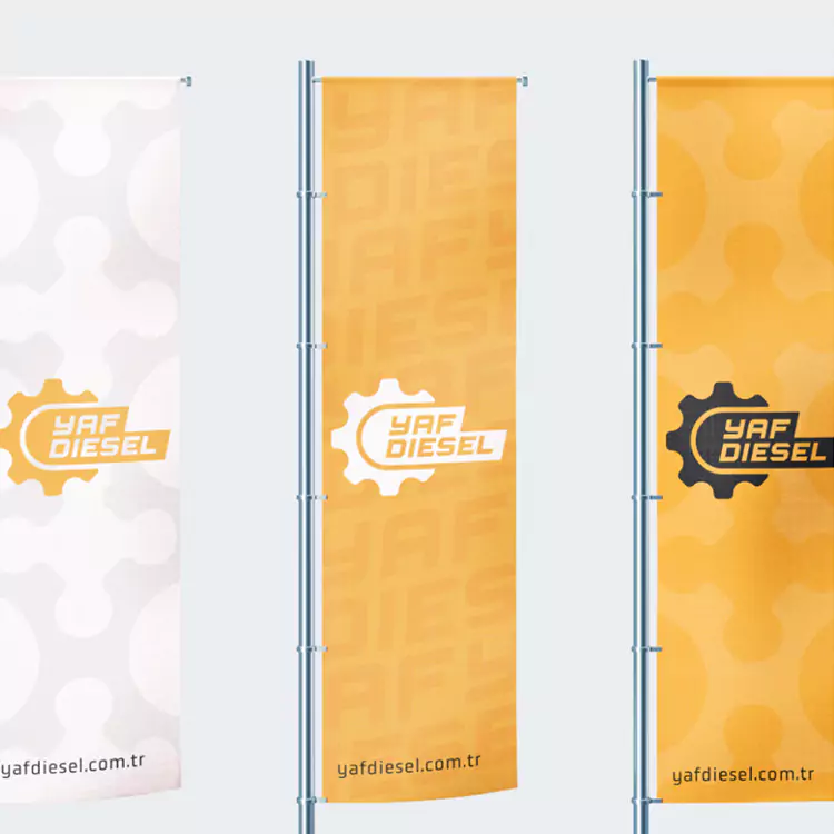
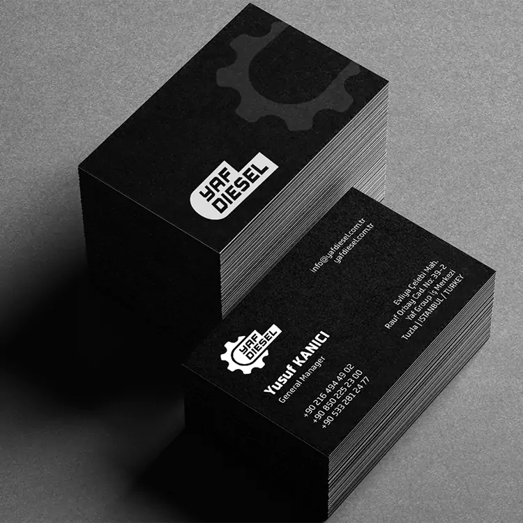
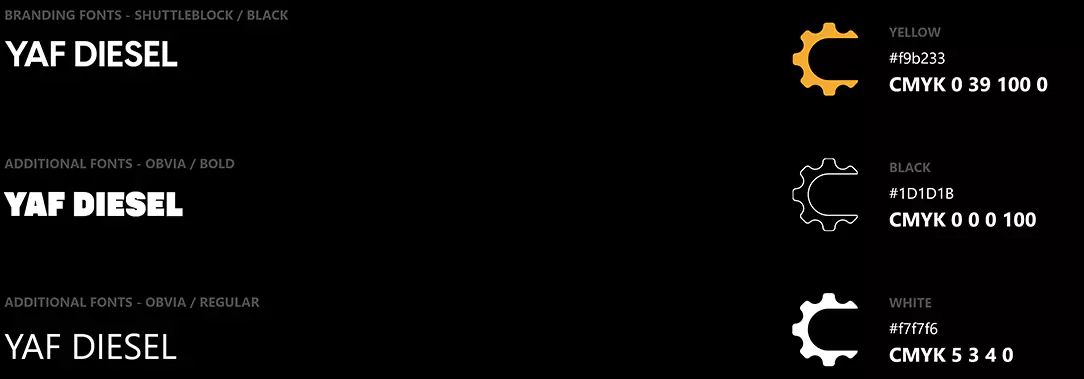
Alongside the new logo design, we redefined Yaf Diesel's entire visual identity. We created a corporate identity guide, planning every aspect of the brand's visual representation from A to Z.
DESIGN ELEMENTS


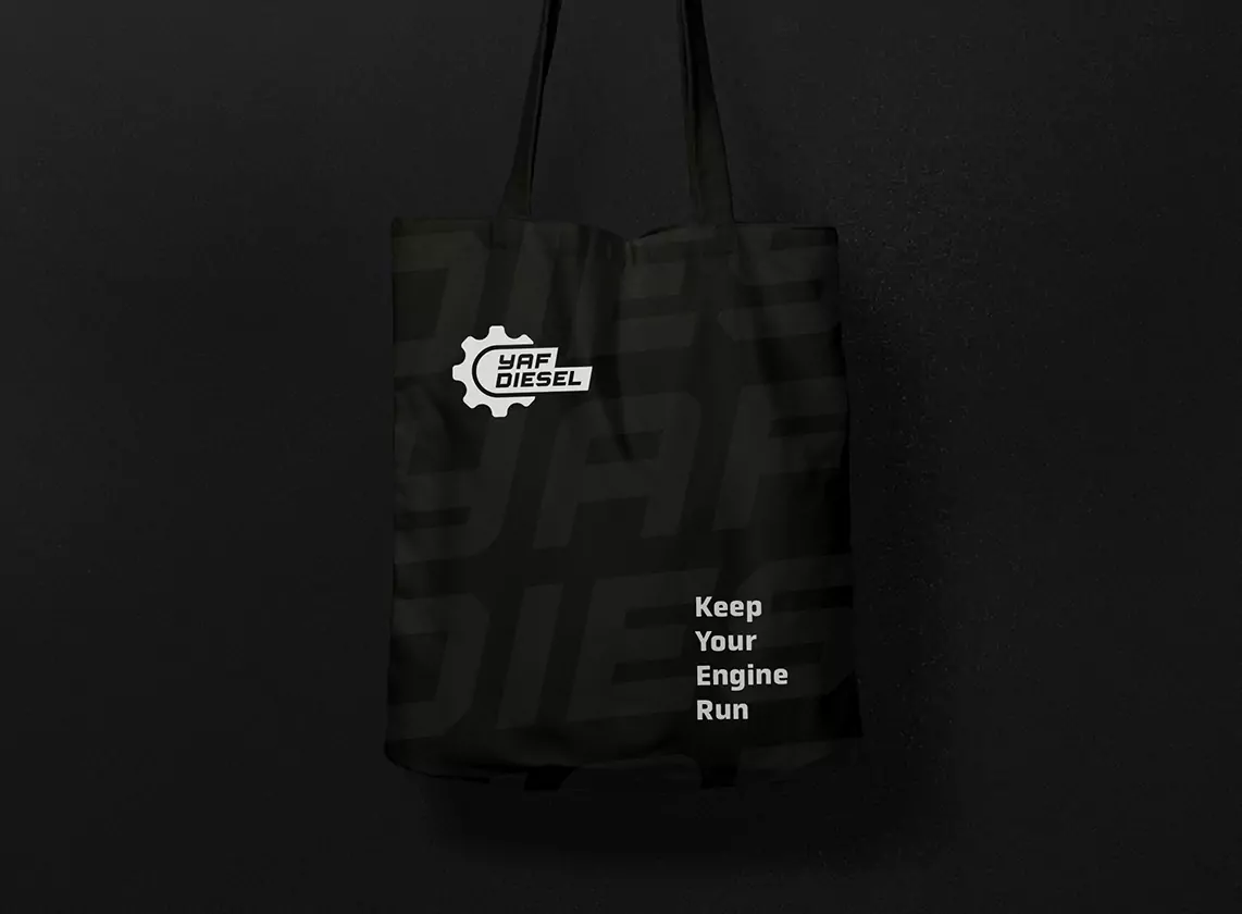
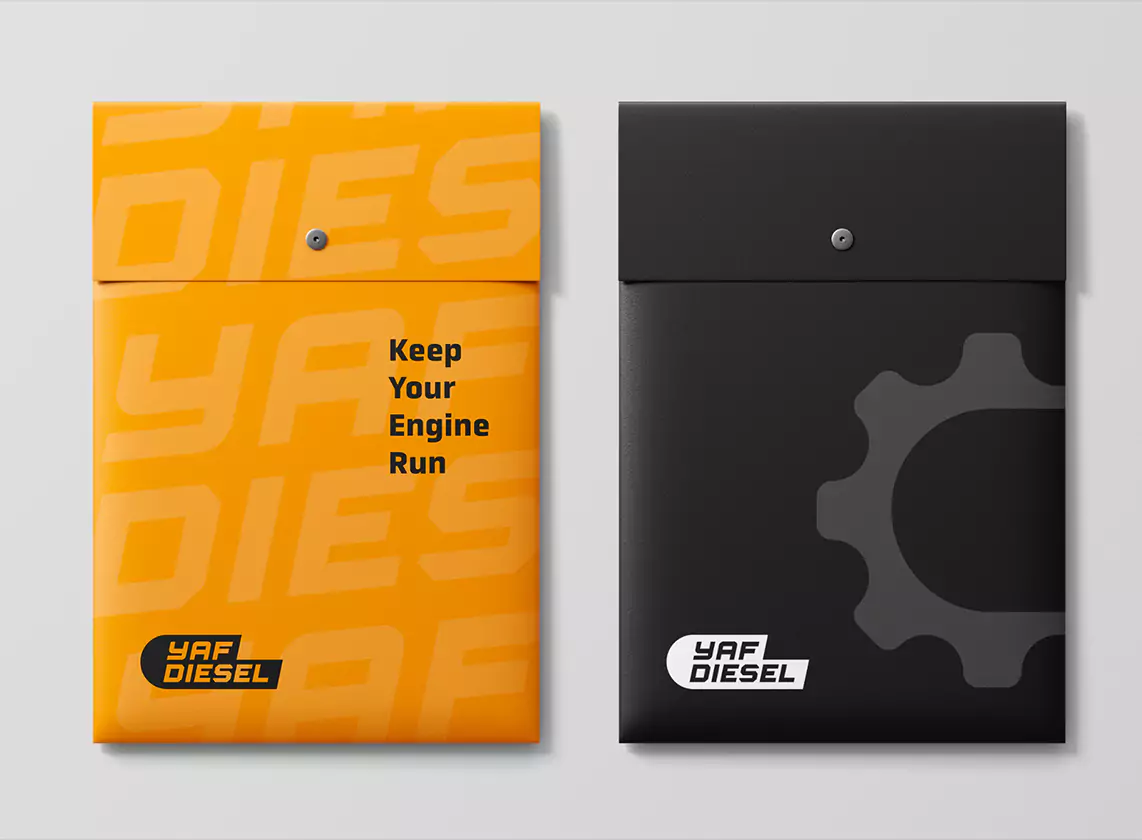
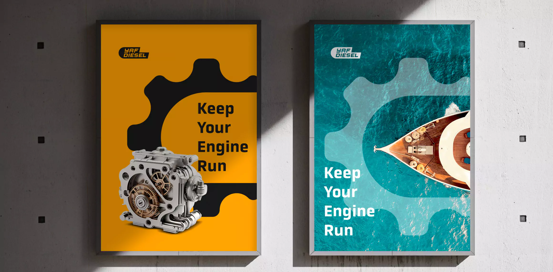
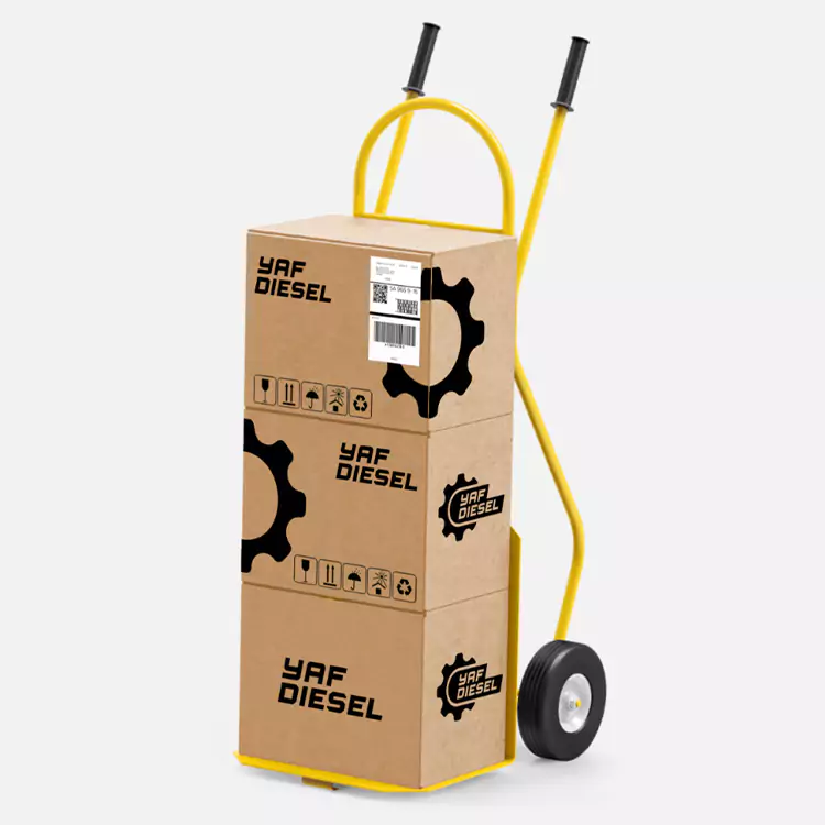
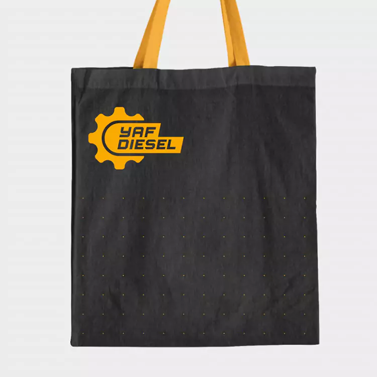
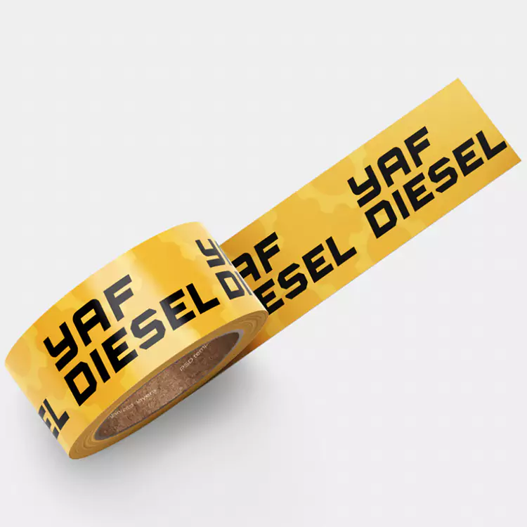
Applications of the Corporate Identity
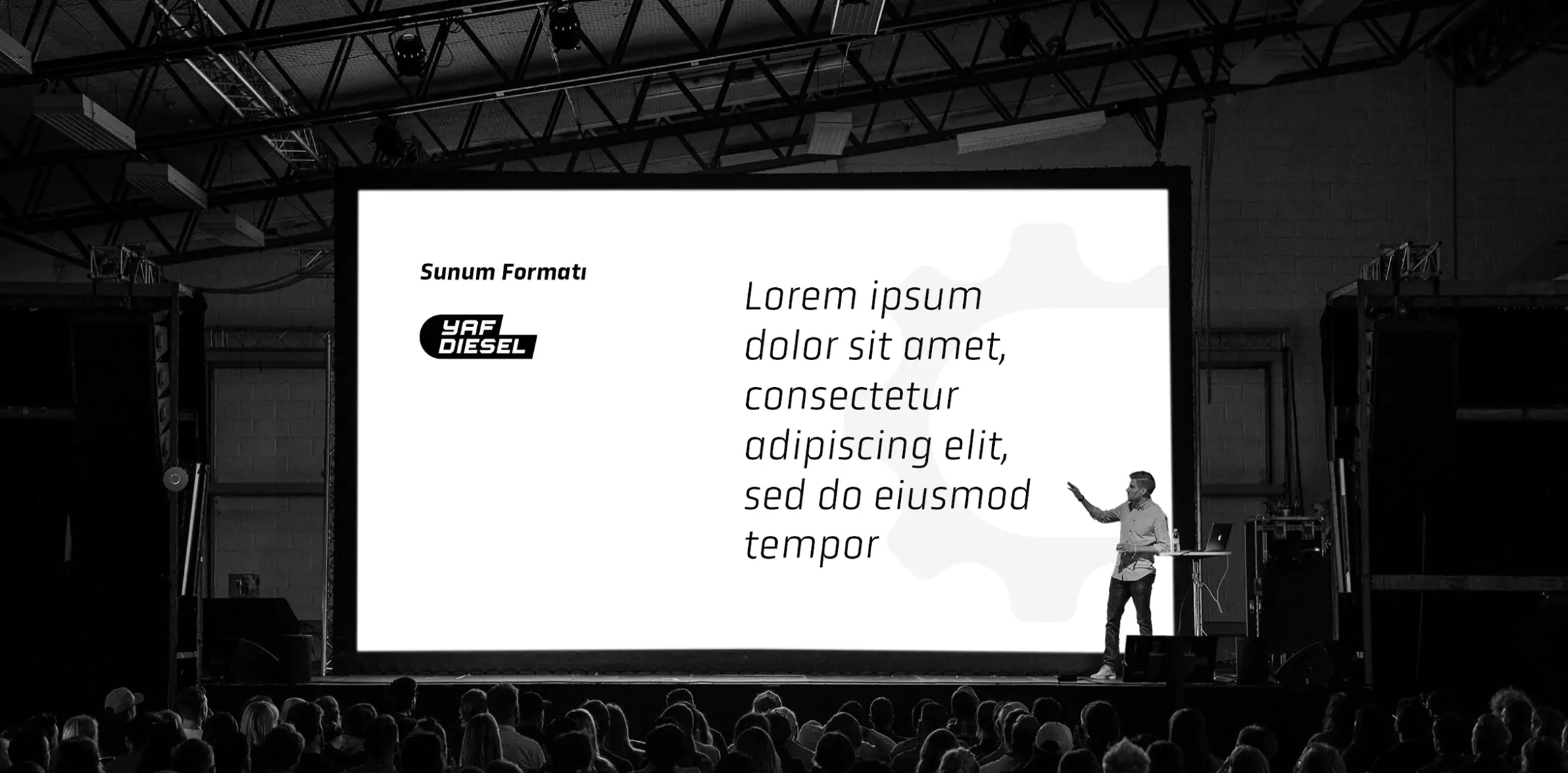
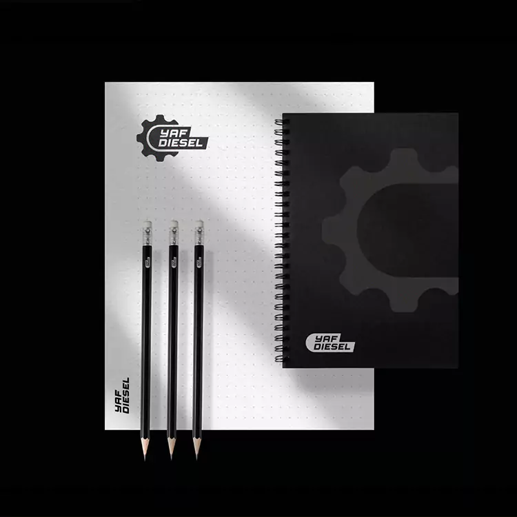
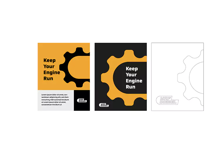
We refreshed all of the brand's visual materials and developed sample design approaches for alternative uses and potential future applications.
As a result of these efforts, Yaf Diesel's visual identity has been thoroughly revamped. The brand now boasts a cohesive visual language, effective storytelling elements, and a modern design aesthetic that is easily adaptable across all platforms.
